
5 font pairings for 5 different projects
As graphic designers, the use of typography is fundamental in our practice. It can elevate our designs from simply art, serving both aesthetic but functional merit. The dynamic use of typography entices the eye and draws the user in allowing them to engage with a design. Here at Launch, we interact with type constantly, deliberating how we should deploy typographic principles to best serve the user. Below are some of the recent font pairings we’ve enjoyed experimenting with, with application to specific mediums, namely packaging, branding, UX/UI, editorial and poster design.

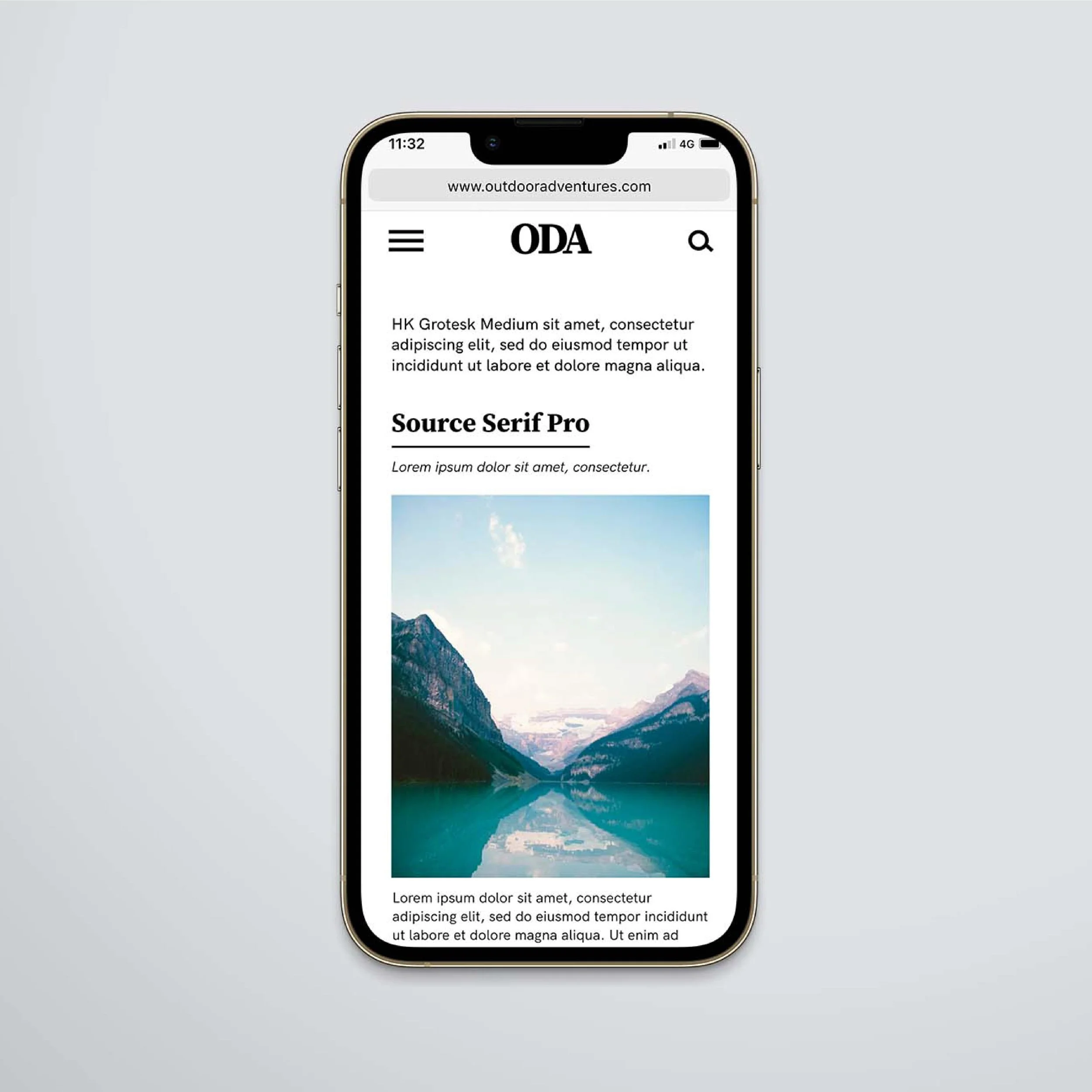
1 | Source Serif Pro & HK Grotesk
Designed for a digital setting, this Source Serif Pro structure is refined and incredibly legible. With historical origins combined with professional supervision, it provides strong characteristics that work perfectly for headings or large size of type. Moreover, paired with HK Grotesk, a beautiful and highly functional sans serif, this font pairing works perfectly for any digital set up.

2 | ARS Maquette & Cormorant Garamond
This font pairing has the perfect balance between function and style, utilising the pairing of serif with sans, offering a dynamic route for your editorial designs. ARS Maquette provides a strong alternative to the more popular typefaces Proxima Nova or Gotham, offering a plethora of distinctive weights to embolden higher levels of type. Furthermore, Cormorant Garamond compliments this bold sans serif, providing a characterful yet legible reading experience, working well at a variety of different sizes and body copy.


3 | Montserrat & Courier New
Bringing notions of the past combined with flawless functionality, this pairing offers a unique and refreshing route for potential packaging designs. With the highly readable experience provided by Montserrat with its web and print friendly shapes, it compliments Courier New offering contrast and dynamic hierarchy, whilst echoing on a rustic typewriter feel.


4 | Crimson Pro & Cardo
Luxurious and elegant, this sophisticated pairing provides a refined reading experience, complimenting the use of two serif typefaces. The differing stroke weights offer balance and contrast to a design, portraying class and style. When scaled correctly with differing weights this pairing works beautifully for title and sentence case levels.


5 | DX Sitrus & HK Grotesk
Elevate your poster designs with this vibrant font pairing, using DX Sitrus’ extravagant curves and dynamic forms, perfect for headings and higher levels of text. This title case font provides nothing but style and class, guaranteed to entice the user. Paired with HK Grotesk, this sans serif offers geometry and grounding, perfect for bringing uniformity to your designs.


What do you think? We’d love to hear from you – whether it’s with your thoughts or if you’ve used these pairings in your own project! Let us know!