Colour theory in design
What is colour theory?
Colour theory encompassed design application, connotations, definitions and concepts.
The colour wheel
Based on the colour wheel, there are three categories.
Primary
Red, yellow and blue
primary colours are the three pigment colours that cannot be mixed or formed by any combination of other colours. All other colours are derived from these 3 hues.
Secondary
Green, orange and purple
These are the colours formed by mixing the primary colours.
Tertiary
These are the colours formed by mixing a primary and a secondary colour. That's why the hue is a two-word name, such as blue-green, red-violet, and yellow-orange.
Colour in context
Here is an example of how three colours can be perceived as four. Observing the effects colours have on each other is the starting point for understanding the relativity of colour. The connections between brightness, intensity and the warmth or coolness of specific hues can lead to significant variations in how we perceive colours.
Colour Connotations
Adobe has a really helpful guide on using colour to enhance your design! Click here
Clara’s Corner Colour palette
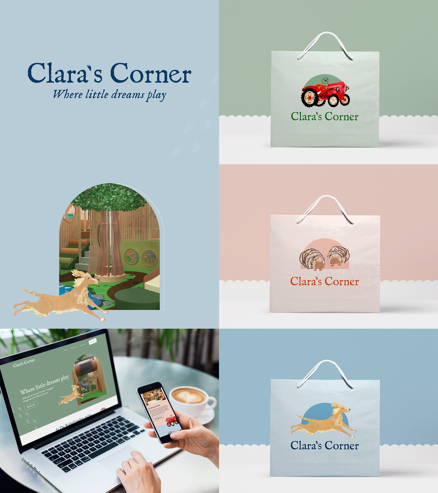
Here is an example of how we used colour in the Clara’s Corner branding to support the brand messaging. Clara’s Corner is a haven where children can unleash their curiosity, discover new worlds, and revel in the excitement of play... Fostering an environment that encourages children to explore, learn, and create joyful memories.
When choosing the colour palette, we wanted it to reflect the following values:
Warm and welcoming
Playful and light-hearted
Inclusive and supportive
Informative and reassuring
Empathetic and understanding
Encouraging and creativity
Express gratitude
Represent a consistent brand voice
Clara’s Corner colour palette
Clara’s Corner
We tested the colour theory on Clara’s Corner by swapping out the colour palette with Alocura. Alocura provides services in health and social care, characterised by brand values such as efficiency, innovation, boldness, and dynamism. As a result, the Clara’s Corner logo now feels more energetic and has lost its warm and welcoming nature.
Overall, colour plays an important role in design due to colour psychology. Always ensure you take your colour connotations into account when designing everything from branding to packaging!


