
Comic Sans is misunderstood
As a designer you often get asked the same questions, one of those being ‘what do you think of Comic Sans?’. The general consensus, it seems, from non-designers is that Comic Sans is an inherently bad typeface. I would argue however that is not, it is just misused. Typefaces are designed for specific purposes, contexts and the sizes they will be displayed at. Some are designed specifically for digital context, others for small print on a newspaper, and others for display at large sizes on a motorway sign.
The reason the general public tend to believe that Comic Sans is a bad typeface is that it is often misused by non-designers in contexts where it does not work. Examples of this include shop signs, warning signs and any sort of important documentation. Comic Sans draws its form from typefaces seen in comic books providing it with a friendly, informal appearance. This appearance is intentional as Comic Sans was designed for use in children’s reading materials. When utilised in this context, Comic Sans works well.

Comic Sans misused on a ski lift to provide important information.
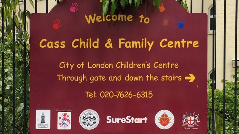
Comic Sans in use for the sign of a children’s centre, the friendly appearance of Comic Sans makes it ideal for use in schools and childcare. [Image courtesy of Comic Sans Shop Signs Tumblr].
Below are examples of typefaces being correctly used in the context which they were designed for.
DIN 1451
DIN 1451 is a typeface that was originally designed for industrial purposes. This typeface lends itself to applications such as signage due to its legibility from afar and lack of unnecessarily decorative letterforms.
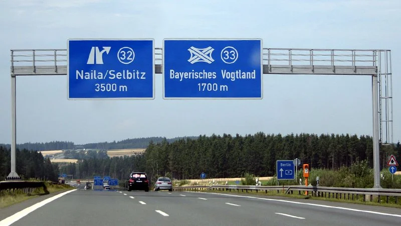
DIN in use on a German autobahn. [Image courtesy of Wikipedia].
Open Sans
Open Sans is a humanist san-serif typeface that was commissioned by Google. This typeface was designed to be used for digital applications due to its legible qualities at small sizes.

Open Sans in use on Chase Bank’s website. [Courtesy of Chase Bank].
Times New Roman
Times New Roman was created in 1931 by commission of The Times Newspaper. The typeface is designed specifically for continuous reading and is slightly narrower then other faces – making it an ideal choice for newspapers. This serif typeface has letterforms with clear contrast which makes it easier for readers to discern between words and allow comfortable reading.

Times New Roman in use in the Times Newspaper in 1932. [Courtesy of New York Public Library].
With countless typefaces existing in the world, it is a designer’s job to pick the right typeface for the right medium and context. As shown by the examples above, the right typeface can elevate a design and aid the solution to a design problem. However, when a typeface is misused, like comic-sans, it can quickly become associated with bad design and lead to designers always being asked to defend its existence.