
Typefaces and feelings
As discussed in our previous blog post tackling the topic of Comic-Sans, typefaces are designed for specific contexts and purposes. A type designer will take into account the size and medium in which a typeface will be used to inform the design process. There is another aspect that informs the design and choice of a particular typeface and this is its ‘feel’. This may sound like quite a conceptual idea but it has tangible applications. The ‘feel’ of a typeface can refer to the idea and feelings it conjures in viewers either through its aesthetic appearance, historical association or common applications. Below are examples of particular typefaces or styles and their applications and associations unpacked.
Typefaces associated with time periods
Cooper Black, although still used widely today, has strong associations to a particular era – the 1960s and 1970s. Despite being created in the 1920s with the intended use of magazine and newspaper advertising, the typeface was highly popular in the 60s and 70s. Cooper Black’s wide use in this period has created an association that often makes people see the typeface as quite dated.
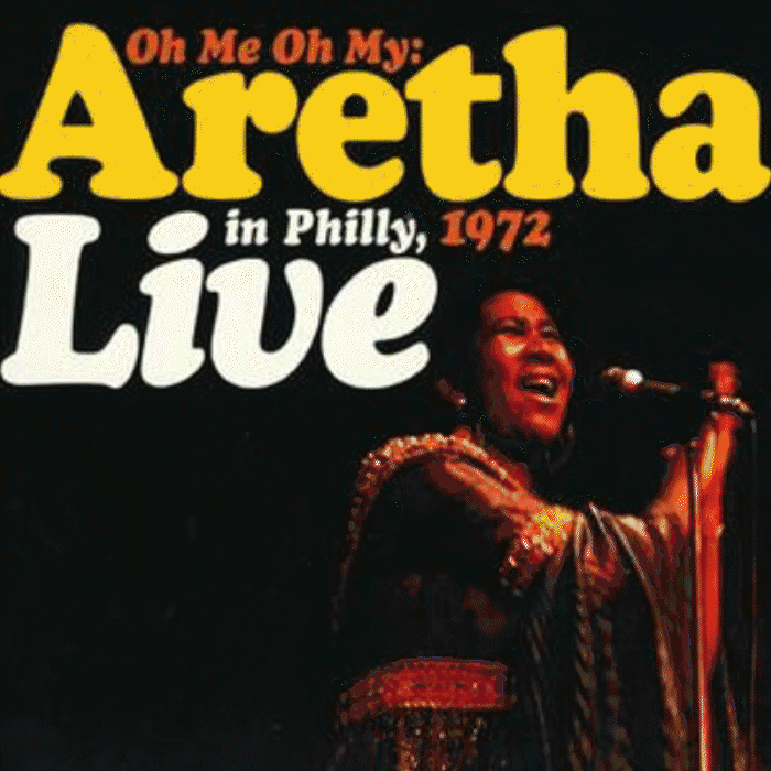
1960s and 70s album covers using Cooper Black. [Images sourced from Steve Hoffman Music Forums].
Common application of a typeface
Originally designed in the early 20th century for their practical use on metal typesetting machines, stencil fonts have since become synonymous with the military. The military association may have began with a practical use as stencil typefaces are can be easily applied through stencil onto military equipment.
Another style of typeface with assocations is slab serifs, this style was created in the 19th century for advertising on posters, then known as ‘bills’. This classification of typefaces has now become heavily associated with US colleges and specifically their sports teams.
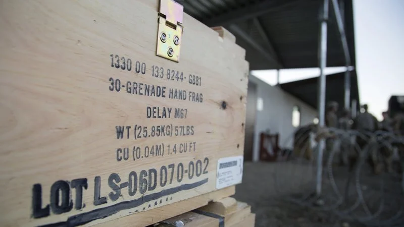
Stencil typefaces have become heavily associated with military use. [Image courtesy of Pixel Smith Studios].
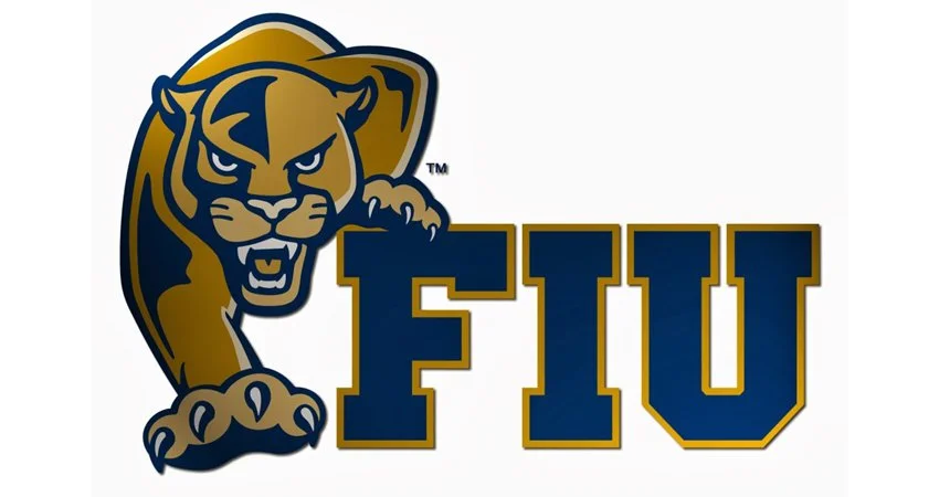
Florida International University Panthers are a college American football team, their logo is a classic use of the slab serif styling associated with US colleges. [Image courtesy of Communications Degrees].
Typefaces that conjure certain ideas
Older serif typefaces provide a more classical, antiquated aesthetic which often sees them utilised for brands who want to portray themselves as timeless, sophisticated and to evoke a sense of history. Examples of such are reputable newspapers, high-end magazines and luxury brands.
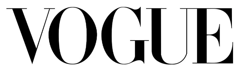
The Vogue logo uses a modified version of Didot, a family of typefaces orginally created in the early 19th century. [Image courtesy of Wikipedia]
Typefaces defined by famous applications
The London tube is world famous and is often visually associated with London. The typeface used across the underground system is Johnston Sans. Due to its famous and continued use in this application the typeface has gained associations with not only the tube but London and the UK as a whole. This typeface now conjures the ‘feel’ of an entire country through its notable deployment.
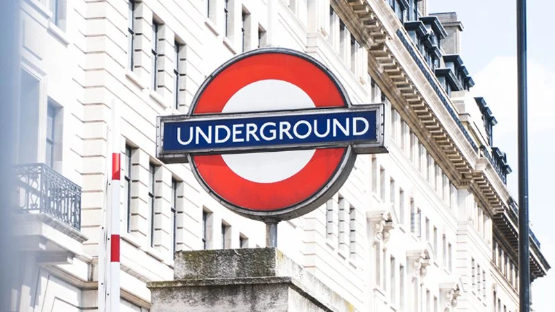
Johnston Sans, used for the London Underground, has become synonymous with London.